
Disclosure: As an Amazon Associate I earn from qualifying purchases. How this site works
Graphic Tee Print Methods
The print method changes how a tee looks, feels and washes.
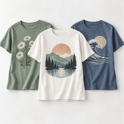 Soft cotton graphic tees
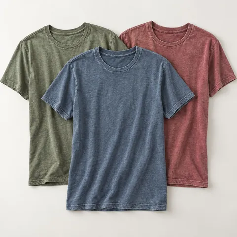 Vintage-wash and tri-blend tees
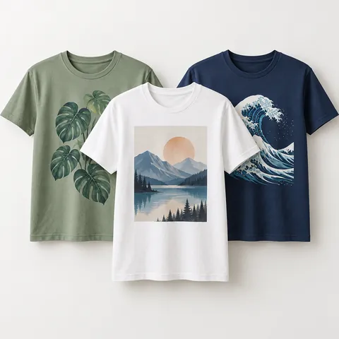 Custom printed tees
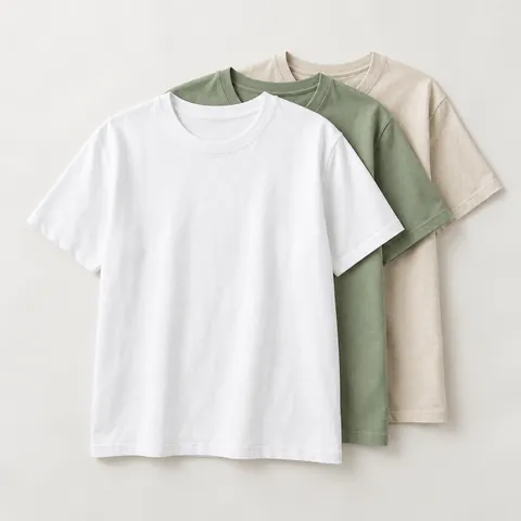 Organic cotton tees
At a glance
| Method | Best for |
|---|---|
| Screen print | Bold designs, bigger runs |
| DTG | Detailed or photo designs, small runs |
| Heat transfer / DTF | Vivid colour on many fabrics |
| Sublimation | All-over prints on polyester |
Care differences
Heat-applied transfers dislike high heat in the dryer and iron; DTG prints last longer with cold washes and air drying; screen prints are the most forgiving.
Browse custom printed tees.
Which print method is best for your graphic tee design?
Start with the artwork, then choose the method. A one- or two-color slogan, logo, or simple illustration usually points toward screen printing because the ink lays down cleanly and the edges look bold. A photo, watercolor effect, or design with many small color changes usually points toward DTG because it can print fine detail without separating each color into its own screen.
Heat transfer and DTF are useful when you want strong color on fabrics that are harder to print directly, or when you are ordering one shirt at a time. The print is applied as a film or transfer, so it can feel more noticeable on the fabric than DTG, especially on large solid graphics. Sublimation is different: the dye bonds into polyester, so it is best when you want a print that does not sit on top of the shirt.
If you are shopping for ready-made women’s graphic tees, the product page may not always name the print method. Use the feel and finish as clues: a slightly raised, ink-like graphic is often screen print; a soft print that blends into cotton may be DTG; a smooth, plastic-like surface with crisp edges may be heat transfer or DTF; and an all-over print on a polyester tee may be sublimation.
| Your design or goal | Method to consider | What to watch for |
|---|---|---|
| Simple text or bold art | Screen print | Setup makes more sense for larger quantities than one-off shirts. |
| Photo, gradient, or detailed art | DTG | Works best when the blank shirt and artwork are prepared correctly. |
| Bright print on many fabric types | Heat transfer or DTF | Large prints can feel heavier or less breathable. |
| All-over print on a white or light poly tee | Sublimation | Not a good choice for a classic cotton tee look. |
| Single custom gift shirt | DTG or heat transfer | Check the seller’s artwork file requirements before ordering. |
How does each print method feel on a women’s tee?
Print feel matters more on fitted, cropped, and lightweight women’s tees because the graphic moves close to the body. A thick print across the chest can feel warm or stiff, while a softer print can drape more naturally with the fabric. The same design can feel different depending on shirt weight, fabric blend, print size, and ink coverage.
Screen printing can range from soft to thick. A small left-chest graphic may be barely noticeable, while a large white ink print on a dark tee may have more texture because it needs enough ink to cover the base fabric. Specialty inks, puff effects, and heavy ink layers will usually feel more raised.
DTG often has a softer hand on cotton because the ink is printed into the fabric surface rather than applied as a separate sheet. On darker tees, the printer may use a white underbase, which can add a little more feel. Heat transfer and DTF usually have the most defined edge and surface feel, though better transfers are thinner than old-style vinyl prints.
Sublimation has the least surface feel because the dye becomes part of the polyester fibers. The trade-off is fabric choice: if you prefer the feel of soft cotton graphic tees, sublimation is usually not the method that creates that classic cotton tee texture. For everyday casual wear, soft cotton graphic tees may feel better than slick performance-style polyester.
- Choose smaller print areas if you want better breathability.
- Avoid very large solid rectangles if you dislike stiffness across the front.
- Look for words such as soft-hand, water-based, discharge, or garment-dyed if you want a more worn-in feel, but still check the fabric and print details.
- For oversized tees, a heavier print may be less noticeable because the shirt does not pull tightly across the body.
- For cropped or fitted tees, pay closer attention to where the graphic lands on the chest and hem.
What should you check before ordering custom graphic tees?
Before uploading art or approving a proof, decide whether the shirt is for one person, a small event, resale, or long-term uniform use. The right print method can change based on quantity and repeat orders. Screen printing may be efficient for repeat designs, while DTG or DTF can be easier for one-off shirts, names, or limited color runs.
Artwork quality is just as important as the print method. Low-resolution files can make even a good printer look blurry. Use the largest original file you have, keep text readable at the final print size, and avoid tiny details that will disappear into fabric texture. If the design includes a transparent background, check that the file actually preserves transparency rather than placing the art on a white box.
Ask how the print size will be adjusted for women’s cuts. A graphic that looks balanced on a boxy unisex tee may sit too low or too wide on a fitted tee, cropped tee, or V-neck. For a chest print, the center point and top edge matter; for a back print, consider hair length, neckline, and whether the shirt will be tucked.
If you are ordering custom printed tees, review these details before checkout:
- Confirm the shirt fabric, fit, and size chart instead of relying only on the product photo.
- Check the recommended file type, color mode, background rules, and minimum resolution.
- Ask whether dark shirts need an underbase, because that can change print feel.
- Review the mockup for placement, not just the design itself.
- Order one sample first if the shirts are for a group, sale, or event where consistency matters.
- Read the return policy carefully; customized shirts are often final sale unless there is a production error.
How do fabric, color, and fit affect the print choice?
The blank tee is half the result. Cotton, polyester, rayon blends, ribbed knits, slub fabrics, and garment-dyed tees all take prints differently. Smooth cotton is a common choice for DTG and screen printing because it gives the artwork a cleaner surface. Very textured fabrics can make fine lines look broken, even when the print is applied correctly.
Dark shirts usually need more planning than white or light shirts. For screen print, DTG, and DTF, the printer may use a white base layer under bright colors so the design does not look dull. That improves color but can add thickness. On light shirts, prints can often feel softer because fewer layers are needed.
Heather and tri-blend tees can give a vintage look because the fabric flecks show through or soften the graphic. That can be attractive for band-style, travel, and retro designs, but it is not ideal if you want a perfectly solid logo color. For a faded, broken-in look, vintage-wash and tri-blend tees are often a better match than a crisp promotional-style print.
Fit also changes how the artwork reads. A boxy oversized tee gives a large design room to sit flat. A fitted tee can stretch the print, especially across the bust. A cropped tee may cut off standard vertical artwork or place the graphic too close to the hem. If the tee has a pocket, seam, ribbed panel, or curved hem, make sure the design is not fighting the garment construction.
Frequently asked questions
Is screen printing or DTG better for small orders?
For one shirt or a very small order, DTG is often the simpler choice because it does not require a separate screen for each color. Screen printing can still be the right choice for simple art if you are ordering enough shirts to make setup worthwhile. If you plan to reorder the same design, ask the printer how repeat orders are handled.
Do heat transfer and DTF prints crack or peel?
They can if the transfer is low quality, applied incorrectly, or dried with too much heat over time. A well-applied transfer should hold up to normal washing, but it still benefits from turning the shirt inside out, using cold water, and avoiding direct ironing on the print. Large transfer areas may show wear sooner than small graphics because they flex more.
Why does my graphic tee print feel sticky or shiny?
A shiny or slightly plastic feel usually means the design is sitting on top of the fabric as a transfer or a heavier ink layer. That is not automatically a defect, but it may feel warmer and less breathable than a soft DTG or light screen print. If you dislike that feel, choose smaller graphics, softer inks, or product descriptions that mention a soft-hand finish.
Can you use sublimation on cotton graphic tees?
Standard sublimation is meant for polyester or polyester-coated surfaces, not regular cotton. On cotton, the dye will not bond the same way, so the print may look weak or wash out. If you want a cotton women’s tee, look at screen print, DTG, or a transfer method instead.
Disclosure: As an Amazon Associate I earn from qualifying purchases. This site may earn a commission when you buy through its links, at no extra cost to you. Product details come from public manufacturer information; always check the merchant page for current specifications and prices. We have not hands-on tested the products described here.